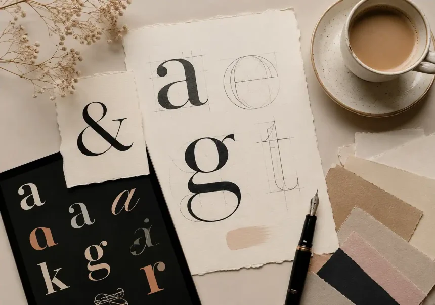
What “Font Aesthetic” Really Means
Choosing a font isn’t just picking a typeface—it’s designing a feeling. Your font aesthetic is the visual personality your text projects across Instagram captions, logo wordmarks, websites, packaging, and ads. In practice, it blends type choice, spacing, contrast, and color to communicate brand values like minimal, playful, luxurious, retro, or edgy.
A reliable process for shaping your font aesthetic:
- Define your brand traits (e.g., friendly, premium, technical).
- Identify your primary audience and platform contexts (mobile feeds vs. print vs. web).
- Select a core typeface family (or two) that scales from headlines to body.
- Set hierarchy with sizes, weights, and letter-spacing.
- Test legibility at small sizes and in dark/light modes.
- Create a reusable style guide (pairings, do’s/don’ts, tracking, and color use).
Principles That Make Fonts Perform
Legibility vs. personality
High-contrast serifs and experimental scripts look stunning in large formats but can collapse on small screens. For Instagram and mobile-first brands, start with robust letterforms and moderate stroke contrast. Let personality shine in headlines; keep captions, bios, and CTAs clean and readable.
Hierarchy and rhythm
A strong font aesthetic uses clear hierarchy—H1, H2, H3, body, caption—so eyes flow effortlessly. Control rhythm with consistent line-height (1.3–1.6 for paragraphs), thoughtful margins, and restrained character spacing. Consistency = perceived professionalism.
Scale and optical sizing
Many modern type families ship with optical sizes (Text, Display). Use Display cuts for big hero headlines and Text cuts for body to avoid thin strokes breaking on low-resolution screens.
Contrast and color
Type contrast isn’t only black vs. white. Soft neutrals, off-black, and brand tints can improve comfort without sacrificing accessibility. Strive for WCAG AA contrast and test in light/dark backgrounds.
Font Aesthetic Styles That Win on Instagram
Minimal & modern
- Fonts: Neo-grotesques (e.g., Inter, Helvetica Now), geometric sans (e.g., Poppins, Futura-inspired), humanist sans (e.g., Calibri, Frutiger-inspired)
- Why it works: Crisp forms photograph well, scale in Stories/Reels, and keep carousels uncluttered.
- Use it for: Tech, SaaS, DTC wellness, productivity creators.
Editorial chic
- Fonts: High-contrast serifs (e.g., Playfair Display, Didot-style), refined transitional serifs (e.g., Baskerville)
- Why it works: Delivers magazine polish; pairs beautifully with photography and neutral palettes.
- Use it for: Beauty, fashion, interiors, boutique hospitality.
Soft retro
- Fonts: Rounded serifs, 70s-inspired display (e.g., Cooper-esque, Recoleta-style), bubbly sans
- Why it works: Warm nostalgia boosts memorability and approachability.
- Use it for: Cafés, lifestyle creators, vintage markets, family brands.
Bold brutalist
- Fonts: Industrial grotesques, condensed sans, mono-inspired display
- Why it works: High-impact posters and carousels; thrives on stark layouts and high contrast.
- Use it for: Streetwear, music promotions, galleries.
Handwritten & script
- Fonts: Casual brush, monoline scripts, signature styles
- Why it works: Feels intimate and human; great for overlays, quotes, and personal brands.
- Use it for: Creators, coaches, photography studios.
Logo-Ready Font Aesthetic Strategies
Choose families with breadth
Pick type families with multiple weights, widths, and italics. This future‑proofs brand evolution and lets you derive sub-brands without switching fonts.
Customize, don’t over-distort
Micro-customizations (tweaked terminals, unique ligatures, alternate glyphs) can turn a common font into a distinctive wordmark. Keep spacing optical—logo letters rarely use default tracking.
Mind the negative space
Evaluate counters and spacing at micro and macro scales. A logo must read at 20 px and on a billboard. Build a black-and-white master before adding effects.
Test for collisions and reproduction
Ensure clean shapes for embroidery, foil stamp, or laser cut. Avoid hairline serifs or delicate swashes that disappear in production.
Smart Pairings for Cohesive Branding
Serif + Sans (classic contrast)
- Headline: Elegant serif (Display)
- Body/UI: Humanist or neo‑grotesque sans
- Vibe: Editorial authority with digital clarity
Sans + Sans (nuanced modern)
- Headline: Geometric or condensed sans
- Body/UI: Workhorse neo‑grotesque
- Vibe: Clean, scalable systems design
Script + Sans (signature flair)
- Headline/logotype: Signature script
- Support: Minimal sans
- Vibe: Personal yet professional
Tip: Limit to two type families. Use weight, size, and color for variety instead of adding more fonts.
Practical Settings for Instagram and Web
Instagram carousels
- Headline: 96–132 px (Display cut), tight leading (0.9–1.1)
- Subhead: 60–84 px
- Body: 36–48 px
- Tracking: Slightly negative for big headlines; 0–+10 for body
- Safe margin: Keep 60–80 px from edges to avoid UI crop
Reels and Stories
- Use bold weights and high-contrast backgrounds
- Keep line length under ~32 characters per line
- Export at 1080×1920 with vector text when possible
Web and mobile
- Base size: 16–18 px
- Line-height: 1.5–1.7
- Max line length: 60–75 characters for readability
- Use variable fonts when available to fine‑tune weight on the fly
Trends Influencing Font Aesthetic in 2026
Variable fonts everywhere
One file, infinite axes (weight, width, slant). Variable fonts cut page weight and enable responsive typography across breakpoints.
Neo‑retro and expressive serifs
Designers blend 70s warmth with contemporary spacing. Expect chunky serifs, softened corners, and playful alternates.
Brutal-yet-friendly
Bold grids and oversized type now meet softer colors and rounded details—assertive but approachable.
Accessibility by default
High-contrast color systems, open counters, and dyslexia-friendly spacing are design baselines, not extras.
How to Choose Your Brand’s Font Aesthetic
1) Map brand adjectives to type traits
- Luxurious → high contrast, sharp serifs, refined spacing
- Friendly → rounded terminals, generous x‑height, warm curves
- Tech-forward → geometric forms, monospaced cues, crisp rhythm
- Heritage → slab serifs, small caps, classic figures
2) Stress‑test use cases
Preview your fonts in:
- Small captions and alt text
- Dark mode UIs
- Physical merch (labels, tags, embroidery)
- Motion (lower-thirds, animated carousels)
3) Build a simple type scale
Set base, ratio (e.g., 1.25), and roles (H1–H6, body, caption). Document sizes, weights, letter‑spacing, and color roles.
4) Create guardrails
Define no-go zones: minimum sizes, max tracking, forbidden effects (e.g., excessive shadows), and acceptable alternates. Add export rules for social templates.
Quick Recommendations by Niche
Beauty & skincare
- Aesthetic: Editorial chic or soft retro
- Pairing: Playfair Display + Inter
Fitness & streetwear
- Aesthetic: Bold brutalist
- Pairing: Condensed grotesque + standard grotesque
Tech & SaaS
- Aesthetic: Minimal & modern
- Pairing: Geometric headline + humanist body
Creators & coaches
- Aesthetic: Script + Sans
- Pairing: Signature script + clean sans
Final Checklist Before You Launch
- Do fonts align with your brand adjectives and audience?
- Are headlines readable at a glance on mobile?
- Do you have a documented type scale and pairing rules?
- Have you tested accessibility and production constraints?
- Do your Instagram templates export cleanly without rasterized blur?
Nail your font aesthetic, and your brand voice becomes instantly recognizable—from an Instagram swipe to a storefront sign.