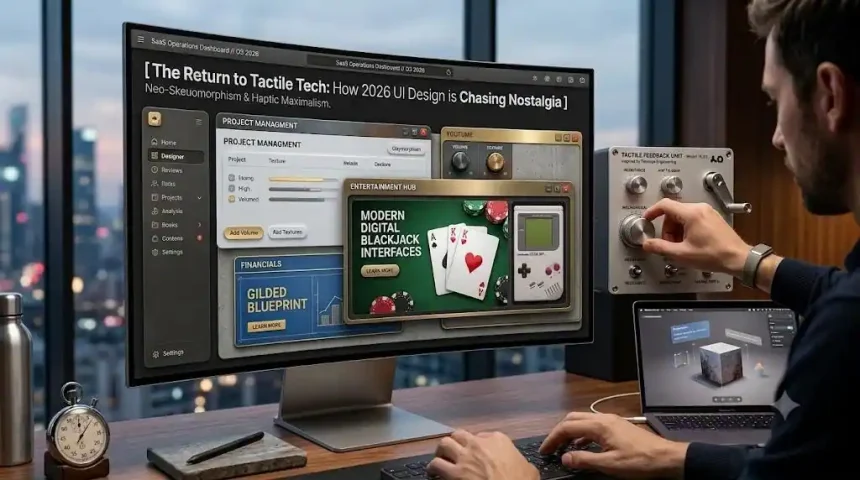
The Cognitive Bankruptcy of the Flat Void
I need to be brutally honest about the last decade. That obsessive push toward hyper-minimalism was an absolute usability nightmare, though agencies certainly dressed it up as high-minded gallery art. Entire teams wasted years sanding down every drop shadow and visual affordance until nothing remained but a slick, confusing vacuum. It looked incredibly clean on a pitch deck.
The catch? Normal human beings suddenly had to memorize abstract geometric languages just to know what on the screen actually did anything. Flat design operated on the arrogant assumption that users inherently knew which elements were system-generated and which held hierarchical priority.
Usability metrics eventually proved what most of us already suspected; the removal of visual depth dramatically increased decision times. People were hesitating. The cognitive burden shifted entirely from the interface onto the user.
The Return of the Squish (and Digital Materiality)
Look closer at the interfaces dominating 2026 and you will see a massive pendulum swing back to reality. Tactile maximalism is entirely rejecting the sterile glass panels of the past decade. Designers are actively injecting physical weight, friction, and texture back into digital components. A button today does not simply change from hex code blue to hex code gray when you tap it. Instead, the element physically deforms under your finger.
We call this “Squishy UI” or claymorphism in the studio; it leverages soft inner shadows to create the distinct illusion of molded clay. You tap the screen, and the button compresses with a deeply satisfying visual bounce. Backgrounds are no longer stark white voids. A subtle layer of organic film grain or transparent noise overlay is almost mandatory now. This microscopic visual noise grounds the interface, transforming a glowing light box into a believable physical surface like paper or felt.
Grease, Grit, and the B2B Soft Industrial Complex
A bad UI decision on a consumer app costs a quick uninstall, but poor legibility on a global supply chain monitor bleeds millions of dollars an hour. The enterprise sector is not adopting heavier aesthetics for fun; these corporations are building defensive systems against operator burnout.
Call this massive shift the “Soft Industrial” aesthetic. Logistics dashboards and financial software used to float in a vacuum of corporate blues. Today, these critical systems borrow visual cues straight from unfinished architectural sites, clean rooms, and machined bank vaults.
When an operator stares at a heavy-data management system for ten hours a day, a completely frictionless interface actually causes profound cognitive fatigue. Physical textures give the user a subconscious psychological anchor. Cybersecurity platforms now utilize an “Anodized Current” palette of deep ocean blues and neon patinas to mimic live electrical motherboards.
Executive fintech suites rely on brushed brass and midnight ink to evoke the precision of bespoke timepieces. This heavy visual weight tells the brain a specific story. It communicates that the software is reliable enough to handle massive enterprise workloads without snapping under pressure.
The Teenage Engineering Wake-Up Call
Frankly, the hardware side of the industry figured this out years ago. Niche physical devices spent the last decade proving that people desperately crave mechanical friction. Swedish design firm Teenage Engineering led the cultural charge here. Their boutique synthesizers force musicians to engage with heavy, resistive faders and loud, tactile mechanical keys.
They even co-designed the Panic Playdate, a handheld entertainment console that featured a literal metal crank as a core input mechanism. Players could not just tap a touchscreen to win. A physical gear had to be ground forward to rewind time or unspool a fishing line in a game.
That intense commercial success sent a massive shockwave through software development teams everywhere. Absolute efficiency is clearly not the ultimate goal of human-computer interaction. People want to feel the machine push back.
Wagering on Physics and the Emulation Boom
Emulation software proved how desperately users want that physical anchor. Applications such as Delta didn’t top the charts just by offering old ROMs in a basic list.
Developers completely surrounded the gameplay with hyper-detailed, glossy 3D renders of chunky plastic controllers—proving that the nostalgic wrapper holds exactly as much value as the software itself. This drive toward physical simulation is absolutely vital in high-stakes digital environments, especially tabletop games. Flat vectors simply cannot convey the financial gravity and tension of a live casino floor, which is exactly why modern digital blackjack interfaces recreate the precise visual weight of a physical card drop.
High-fidelity physics engines snap 3D-rendered cards onto dark green felt, complete with dynamic shadows. Directional audio perfectly mimics the sharp, satisfying sound of cardboard hitting a table. The stakes feel real because the environment behaves according to actual physical laws.
Glass That Bites Back
Visual tricks only go so far before the brain demands literal, physical confirmation. Modern haptic feedback engines have permanently transformed flat glass panels into highly specific multi-sensory environments. Today’s Linear Resonant Actuators deliver mathematically precise micro-bursts of vibration that trick your nerve endings into feeling non-existent mechanical springs.
A high-end digital switch press triggers a sharp, ten-millisecond burst at maximum intensity, immediately followed by a softer release tap. Financial sliders actually alter their haptic resistance dynamically based on the monetary value you select. A ten-thousand-dollar transfer slider physically feels heavier and requires more thumb pressure to drag than a ten-dollar tip. The hardware is actively communicating value through friction.
Contemporary smartphone displays even incorporate OLED micro-vibrations for localized feedback. The screen generates a physical response exactly where your thumb makes contact, leaving the rest of the chassis completely still. This localized precision allows an interface to literally guide a user’s hand across the screen blindly.
The Spatial Volume Mandate (and Anti-Perfect AI)
Put a standard, paper-thin menu inside a premium spatial computing headset. The magic dies the second you look at it. Spatial computing requires physical volume to establish spatial orientation and user trust. Digital objects in augmented reality must possess measurable thickness, cast accurate ambient shadows, and compress along the Z-axis when a user reaches out to poke them.
Tactile maximalism is no longer a fun stylistic choice in these environments; it is a strict functional requirement to prevent cognitive motion sickness. Meanwhile, artificial intelligence is quietly managing the complex layout and pacing of these heavy interfaces. Background algorithms are constantly tracking how fast you tap; they will literally move a button closer to your thumb if you are sprinting for a train. But that machine perfection feels incredibly creepy without some manufactured dirt.
To counter the algorithmic coldness, studios deliberately bake in slight visual mistakes. A wobbly border or a patch of uneven digital noise acts as a vital psychological trick, whispering to the user that an actual human built this tool.
The Escape from the Void
We are finally clawing our way out of the cognitive bankruptcy of the flat void. The design industry spent a full decade forcing human beings to adapt to the cold, frictionless logic of machines, constantly taxing our brains to fill in the missing physical cues. Now, the machines are finally being forced to speak the messy, resistive, and heavy language of human touch. The glass screen hasn’t disappeared—it just finally learned how to fight back.